Introduction
Machine learning algorithms are often said to be black-box models in that there is not a good idea of how the model is arriving at predictions.This has often hindered adopting machine learning models in certain industires where interpretation is key. Examples of such areas include financial institutions who are regulated and have to explain decisions such as rejecting loan application or detecting fraud.Also, A healthcare provider may want to identify what factors are driving each patient’s risk of some disease so they can directly address those risk factors with targeted health interventions . Model interprtability allows you to determine how much you can trust a prediction model as a whole,debug, inform human decision making, Inform feature engineering, data collection and provides insights that can be used to improve the model.
First we need to install the libraries for machine learning intrepatabilty and model building. The dataset fro this post can be found here here The data has features to predict heart disease.
Install Packages
!pip  install   matplotlib
!pip install eli5
#pdpbox has some problems in their pypi version
!pip install git+https://github.com/SauceCat/PDPbox
!pip install eli5
!pip install pycebox
!pip install ml_insights
!pip install scikit-optimize
!pip install alepython

#or
#!conda install -c conda-forge shap
!pip install shap
!pip install plotly_express
!pip install seaborn
!pip install category_encoders
!conda install -c conda-forge category_encoders
!pip install --upgrade git+https://github.com/scikit-learn-contrib/categorical-encoding
! pip install lime
!pip install graphviz
!pip install skll
# Load All Libraries
from __future__ import print_function
# future allows compatitbility between python two and three modules
print(__doc__)
import matplotlib.pyplot as plt
import seaborn as sns
from sklearn.base import TransformerMixin
from sklearn.metrics import classification_report, f1_score, accuracy_score, precision_score, confusion_matrix
from sklearn.metrics import roc_auc_score
from sklearn.preprocessing import Imputer
from sklearn.preprocessing import MinMaxScaler
from sklearn.preprocessing import StandardScaler
from sklearn.preprocessing import LabelEncoder
from sklearn.metrics import accuracy_score
from sklearn.model_selection import cross_validate
from sklearn.linear_model import LogisticRegression
from sklearn.ensemble import RandomForestClassifier
from xgboost import XGBClassifier
from lime import lime_text
from sklearn.pipeline import make_pipeline
from sklearn.pipeline import Pipeline
import sklearn
import sklearn.datasets
import sklearn.ensemble
import sklearn
import numpy as np
import pandas as pd
import lightgbm as lgb
from sklearn.datasets import load_boston
import xgboost as xgb
import numpy as np
import statsmodels.api as sm
from sklearn.model_selection import train_test_split
from sklearn.model_selection import *
from sklearn.model_selection import GridSearchCV
from sklearn.metrics import mean_squared_error
import matplotlib.pyplot as plt
from sklearn.model_selection import KFold
from sklearn import preprocessing
import plotly_express as px
import datetime
from datetime import *
import seaborn as sns; sns.set()
import shap
import warnings
from eli5.sklearn import PermutationImportance
from sklearn.preprocessing import Imputer
from sklearn.model_selection import  cross_val_score
from sklearn.pipeline import Pipeline
from sklearn.metrics import make_scorer
from sklearn.ensemble import RandomForestRegressor
#from alepython  import *

from skll.metrics import spearman

from skopt import BayesSearchCV
from skopt.space import Real, Categorical, Integer


warnings.filterwarnings("ignore", category=FutureWarning)
#from __future__ import print_function
Automatically created module for IPython interactive environment
Loading Data
link to data This database contains 76 attributes, but all published experiments refer to using a subset of 14 of them. In particular, the Cleveland database is the only one that has been used by ML researchers to this date. The “goal” field refers to the presence of heart disease in the patient. It is integer valued from 0 (no presence) to 4.
Content
Attribute Information: Only 14 attributes used:
- age: age in years
- sex: sex (1 = male; 0 = female)
- cp: chest pain type – Value 1: typical angina – Value 2: atypical angina – Value 3: non-anginal pain – Value 4: asymptomatic
- trestbps: resting blood pressure (in mm Hg on admission to the hospital)
- chol: serum cholestoral in mg/dl
- fbs: (fasting blood sugar > 120 mg/dl) (1 = true; 0 = false)
- restecg: resting electrocardiographic results – Value 0: normal – Value 1: having ST-T wave abnormality (T wave inversions and/or ST elevation or depression of > 0.05 mV) – Value 2: showing probable or definite left ventricular hypertrophy by Estes’ criteria
- thalach: maximum heart rate achieved
- exang: exercise induced angina (1 = yes; 0 = no)
- oldpeak = ST depression induced by exercise relative to rest
- slope: the slope of the peak exercise ST segment – Value 1: upsloping – Value 2: flat – Value 3: downsloping
- ca: number of major vessels (0-3) colored by flourosopy
- thal: 3 = normal; 6 = fixed defect; 7 = reversable defect
- target: diagnosis of heart disease (angiographic disease status) – Value 0: < 50% diameter narrowing – Value 1: > 50% diameter narrowing (in any major vessel: attributes 59 through 68 are vessels)
import numpy as np
import pandas as pd
from google.colab import files
import io
uploaded = files.upload()
Saving heart.csv to heart.csv
for fn in uploaded.keys():
  print('User uploaded file "{name}" with length {length} bytes'.format(
      name=fn, length=len(uploaded[fn])))
User uploaded file "heart.csv" with length 11328 bytes
#uploaded
heart_data=pd.read_csv(io.StringIO(uploaded['heart.csv'].decode('utf-8')))
heart_data.head()
| age | sex | cp | trestbps | chol | fbs | restecg | thalach | exang | oldpeak | slope | ca | thal | target | |
|---|---|---|---|---|---|---|---|---|---|---|---|---|---|---|
| 0 | 63 | 1 | 3 | 145 | 233 | 1 | 0 | 150 | 0 | 2.3 | 0 | 0 | 1 | 1 |
| 1 | 37 | 1 | 2 | 130 | 250 | 0 | 1 | 187 | 0 | 3.5 | 0 | 0 | 2 | 1 |
| 2 | 41 | 0 | 1 | 130 | 204 | 0 | 0 | 172 | 0 | 1.4 | 2 | 0 | 2 | 1 |
| 3 | 56 | 1 | 1 | 120 | 236 | 0 | 1 | 178 | 0 | 0.8 | 2 | 0 | 2 | 1 |
| 4 | 57 | 0 | 0 | 120 | 354 | 0 | 1 | 163 | 1 | 0.6 | 2 | 0 | 2 | 1 |
heart_data.info()
<class 'pandas.core.frame.DataFrame'>
RangeIndex: 303 entries, 0 to 302
Data columns (total 14 columns):
age         303 non-null int64
sex         303 non-null int64
cp          303 non-null int64
trestbps    303 non-null int64
chol        303 non-null int64
fbs         303 non-null int64
restecg     303 non-null int64
thalach     303 non-null int64
exang       303 non-null int64
oldpeak     303 non-null float64
slope       303 non-null int64
ca          303 non-null int64
thal        303 non-null int64
target      303 non-null int64
dtypes: float64(1), int64(13)
memory usage: 33.2 KB
heart_data.describe()
| age | trestbps | chol | thalach | oldpeak | ca | target | |
|---|---|---|---|---|---|---|---|
| count | 303.000000 | 303.000000 | 303.000000 | 303.000000 | 303.000000 | 303.000000 | 303.000000 |
| mean | 54.366337 | 131.623762 | 246.264026 | 149.646865 | 1.039604 | 0.729373 | 0.544554 |
| std | 9.082101 | 17.538143 | 51.830751 | 22.905161 | 1.161075 | 1.022606 | 0.498835 |
| min | 29.000000 | 94.000000 | 126.000000 | 71.000000 | 0.000000 | 0.000000 | 0.000000 |
| 25% | 47.500000 | 120.000000 | 211.000000 | 133.500000 | 0.000000 | 0.000000 | 0.000000 |
| 50% | 55.000000 | 130.000000 | 240.000000 | 153.000000 | 0.800000 | 0.000000 | 1.000000 |
| 75% | 61.000000 | 140.000000 | 274.500000 | 166.000000 | 1.600000 | 1.000000 | 1.000000 |
| max | 77.000000 | 200.000000 | 564.000000 | 202.000000 | 6.200000 | 4.000000 | 1.000000 |
Model Training
We will train a binary classification model using xgboost model to predict Income of a person using features in the dataset above.
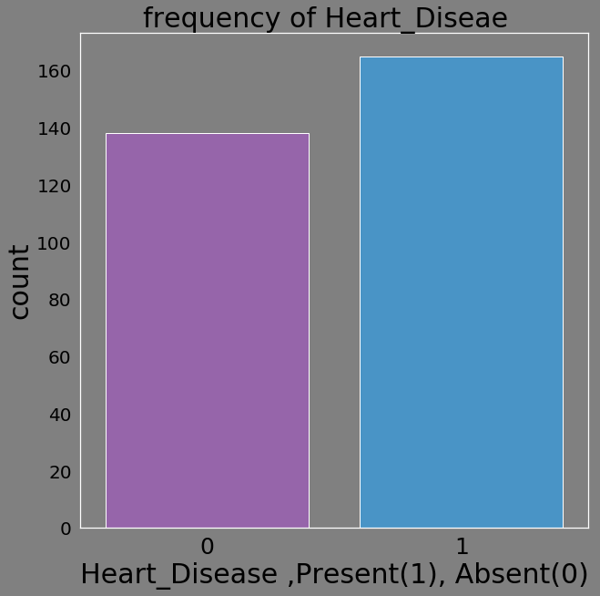
d=pd.DataFrame(heart_data.target.value_counts())

d=d.reset_index()

d.columns=['Prediction','Frequency']

d['Prediction']=d['Prediction'].astype('category')
d['Prediction']=d['Prediction'].astype(str)
d
d['Heart_Diseae']=['Present','Absent']
#d.dtypes()
d.info()

#px.bar(d, x="Heart_Diseae", y="Frequency",orientation="v", color='Heart_Diseae')
<class 'pandas.core.frame.DataFrame'>
RangeIndex: 2 entries, 0 to 1
Data columns (total 3 columns):
Prediction      2 non-null object
Frequency       2 non-null int64
Heart_Diseae    2 non-null object
dtypes: int64(1), object(2)
memory usage: 128.0+ bytes
bg_color = (0.5, 0.5, 0.5)

sns.set(rc={"font.style":"normal",
            "axes.facecolor":bg_color,
            "axes.titlesize":30,
            "figure.facecolor":bg_color,
            "text.color":"black",
            "xtick.color":"black",
            "ytick.color":"black",
            "axes.labelcolor":"black",
            "axes.grid":False,
            'axes.labelsize':30,
            'figure.figsize':(10.0, 10.0),
            'xtick.labelsize':25,
            'ytick.labelsize':20})

#plt.rcParams.update(params)
flatui = ["#9b59b6", "#3498db", "#95a5a6", "#e74c3c", "#34495e", "#2ecc71"]
sns.countplot(heart_data.target,palette=flatui)
plt.xlabel('Heart_Disease ,Present(1), Absent(0)')
plt.title('frequency of Heart_Diseae  ')
plt.show()
X=heart_data.drop('target',axis=1)
Y=heart_data.target
scaler = StandardScaler()

#X = scaler.fit_transform(X)


train_X, val_X, train_y, val_y = train_test_split(X, Y,test_size=0.3, random_state=148)
Categorical Variable Encoding
Target encoding is one of the bayesian encoders for categorical variables. One-Hot does not work well for tree-based models and high cardinality features.
from category_encoders import *
import pandas as pd


enc = TargetEncoder(cols=['sex', 'cp','fbs','restecg','exang','slope','thal']).fit(train_X,train_y)

# transform the datasets
training_numeric_dataset = enc.transform(train_X,train_y)
testing_numeric_dataset = enc.transform(val_X)


print(training_numeric_dataset.thal.value_counts())

training_numeric_dataset.head()
0.773109    119
0.246753     77
0.357143     14
0.513955      2
Name: thal, dtype: int64
| age | sex | cp | trestbps | chol | fbs | restecg | thalach | exang | oldpeak | slope | ca | thal | |
|---|---|---|---|---|---|---|---|---|---|---|---|---|---|
| 114 | 55 | 0.454545 | 0.885714 | 130 | 262 | 0.574586 | 0.63964 | 155 | 0.708333 | 0.0 | 0.789474 | 0 | 0.773109 |
| 152 | 64 | 0.454545 | 0.647059 | 170 | 227 | 0.574586 | 0.46000 | 155 | 0.708333 | 0.6 | 0.361111 | 0 | 0.246753 |
| 100 | 42 | 0.454545 | 0.647059 | 148 | 244 | 0.574586 | 0.46000 | 178 | 0.708333 | 0.8 | 0.789474 | 2 | 0.773109 |
| 87 | 46 | 0.454545 | 0.885714 | 101 | 197 | 0.419355 | 0.63964 | 156 | 0.708333 | 0.0 | 0.789474 | 0 | 0.246753 |
| 72 | 29 | 0.454545 | 0.885714 | 130 | 204 | 0.574586 | 0.46000 | 202 | 0.708333 | 0.0 | 0.789474 | 0 | 0.773109 |
Converting Numerical features to Categorical features
The categorical features such as sex etc are represented as numeric. We can convert them to categorical courtesy of pandas function astype(‘category’)
cat_cols=['sex', 'cp','fbs','restecg','exang','slope','thal']

heart_data[cat_cols] = heart_data[cat_cols].apply(lambda x: x.astype('category'))


heart_data.info()
<class 'pandas.core.frame.DataFrame'>
RangeIndex: 303 entries, 0 to 302
Data columns (total 14 columns):
age         303 non-null int64
sex         303 non-null category
cp          303 non-null category
trestbps    303 non-null int64
chol        303 non-null int64
fbs         303 non-null category
restecg     303 non-null category
thalach     303 non-null int64
exang       303 non-null category
oldpeak     303 non-null float64
slope       303 non-null category
ca          303 non-null int64
thal        303 non-null category
target      303 non-null int64
dtypes: category(7), float64(1), int64(6)
memory usage: 19.6 KB
cat_cols=['sex', 'cp','fbs','restecg','exang','slope','thal']

for col_name in cat_cols:
    #if(heart_data[col_name].dtype == 'object'):
        heart_data[col_name]= heart_data[col_name].astype('category')
        #heart_data[col_name] = heart_data[col_name].cat.codes


#heart_data[cat_cols] = heart_data[cat_cols].apply(lambda x: x.astype('category'))


heart_data.head(3)
heart_data.info()
<class 'pandas.core.frame.DataFrame'>
RangeIndex: 303 entries, 0 to 302
Data columns (total 14 columns):
age         303 non-null int64
sex         303 non-null category
cp          303 non-null category
trestbps    303 non-null int64
chol        303 non-null int64
fbs         303 non-null category
restecg     303 non-null category
thalach     303 non-null int64
exang       303 non-null category
oldpeak     303 non-null float64
slope       303 non-null category
ca          303 non-null int64
thal        303 non-null category
target      303 non-null int64
dtypes: category(7), float64(1), int64(6)
memory usage: 19.6 KB
train_X.columns.tolist()
[‘age’, ‘sex’, ‘cp’, ‘trestbps’, ‘chol’, ‘fbs’, ‘restecg’, ‘thalach’, ‘exang’, ‘oldpeak’, ‘slope’, ‘ca’, ‘thal’]
train_data=lgb.Dataset(train_X ,label=train_y,feature_name=train_X.columns.tolist(), categorical_feature=cat_cols)


lgb_train = lgb.Dataset(train_X ,label=train_y
 ,feature_name =train_X.columns.tolist()
 , categorical_feature = cat_cols
)


#params = {
# 'task': 'train'
# , 'boosting_type': 'gbdt'
# , 'objective': 'regression'
#   ,'objective': 'binary'
# , 'num_class': num_of_classes
# , 'metric': 'rmsle'
# , 'min_data': 1
# , 'verbose': -1
#}

#lgbm = lgb.train(params, lgb_train, num_boost_round=50)


params = {'num_leaves':150,
         'objective':'binary',
         'max_depth':7,
         'learning_rate':.05,
         'is_unbalance':True,
         'max_bin':200}
params['metric'] = ['auc', 'binary_logloss']


cv_results = lgb.cv(
        params,
        train_data,
        num_boost_round=100,
        nfold=3,
        #metrics='mae',
        early_stopping_rounds=10
        )
/usr/local/lib/python3.6/dist-packages/lightgbm/basic.py:1205: UserWarning:

Using categorical_feature in Dataset.
# Display results
print('Current parameters:\n', params)
print('\nBest num_boost_round:', len(cv_results['auc-mean']))
print('Best CV score:', max(cv_results['auc-mean']))

#cv_results.best_params_
Current parameters:
 {'num_leaves': 150, 'objective': 'binary', 'max_depth': 7, 'learning_rate': 0.05, 'is_unbalance': True, 'max_bin': 200, 'metric': ['auc', 'binary_logloss']}

Best num_boost_round: 26
Best CV score: 0.8793941273779984
#setting parameters for lightgbm

#train_data=lgb.Dataset(train_X ,label=train_y)

param = {'num_leaves':150,
         'objective':'binary',
         'max_depth':7,
         'learning_rate':.05,
         'is_unbalance':True,
         'max_bin':200}
param['metric'] = ['auc', 'binary_logloss']


#training our model using light gbm
num_round=50
start=datetime.now()
lgbm=lgb.train(param,train_data,num_round,feature_name=list(train_X.columns), categorical_feature=cat_cols)
stop=datetime.now()


#lgb_estimator = lgb.LGBMClassifier(boosting_type='gbdt')
#Equivalent way of fitting light gbm

lgb_estimator = lgb.LGBMClassifier(boosting_type='gbdt',
                        # class_weight='balanced', #used only in multiclass training
                         #is_unbalance ='True'   #used in binary class training
                         objective='binary',
                         n_jobs=-1,
                         verbose=0)

lgb_model = lgb_estimator.fit(X=train_X, y=train_y)
#Execution time of the model
execution_time_lgbm = stop-start
execution_time_lgbm
datetime.timedelta(0, 0, 45042)
#predicting the target label on test set
ypred=lgbm.predict(val_X)
print(ypred[0:5])  # showing first 5 predictions

#predicting the target probability on test set
#yprob=lgbm.predict_proba(val_X)
#print(yprob[0:2])  # showing first 5 predictions
[0.84144207 0.48859939 0.93763193 0.86565699 0.10644411]
#predicting the target label on test set
ypred=lgb_model.predict(val_X)
print(ypred[0:5])  # showing first 5 predictions

#predicting the target probability on test set
yprob=lgb_model.predict_proba(val_X)
print(yprob[0:2])  # showing first 5 predictions
[1 1 1 1 0]
[[0.06968765 0.93031235]
 [0.38360334 0.61639666]]
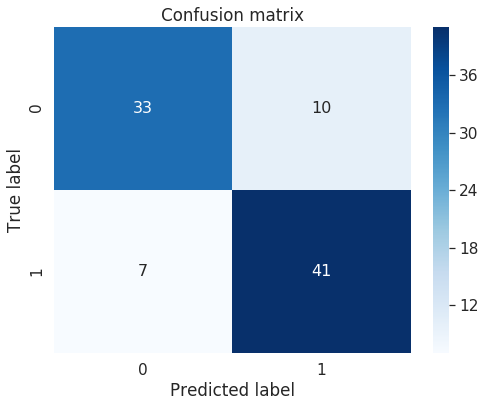
predictions = lgb_model.predict(val_X)
print("Confusion Matrix:")

cm=confusion_matrix(val_y, predictions)

print(cm)

print()
print("Classification Report")
print(classification_report(val_y, predictions))

# ROC curve and Area-Under-Curve (AUC)
#calculating accuracy
accuracy_lgbm = accuracy_score(predictions,val_y)

print('accuracy score : {:0.3f}'.format( accuracy_lgbm))

roc_auc_lgbm = roc_auc_score(val_y,predictions)

print('roc score : {:0.3f}'.format( roc_auc_lgbm))
Confusion Matrix:
[[33 10]
 [ 7 41]]

Classification Report
              precision    recall  f1-score   support

           0       0.82      0.77      0.80        43
           1       0.80      0.85      0.83        48

   micro avg       0.81      0.81      0.81        91
   macro avg       0.81      0.81      0.81        91
weighted avg       0.81      0.81      0.81        91

accuracy score : 0.813
roc score : 0.811
import seaborn as sn
rcParams['figure.figsize'] = 8,6


df_cm = pd.DataFrame(cm, range(2),
                  range(2))
#plt.figure(figsize = (10,7))
sn.set(font_scale=1.4)#for label size
# Show confusion matrix in a separate window
#plt.matshow(cm)
sn.heatmap(df_cm, annot=True,annot_kws={"size": 16},cmap=plt.cm.Blues)# font size
plt.title('Confusion matrix')
#plt.colorbar()
plt.ylabel('True label')
plt.xlabel('Predicted label')
plt.show()
Plotting Model Inferences From lightgbm Library
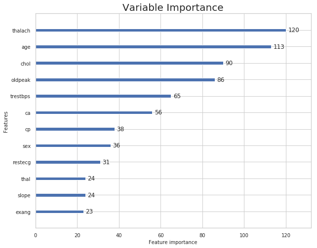
rcParams['figure.figsize'] = 10,8
lgb.plot_importance(lgb_model,title='Variable Importance')
plt.show()
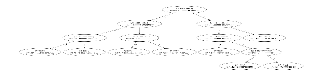
#plt.figure(figsize=(10,10))
lgb.plot_tree(lgb_model)
plt.show()
lgb.create_tree_digraph(lgb_model)

Permutation Importance
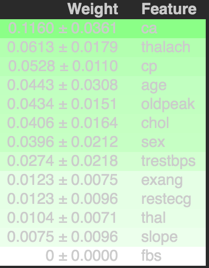
The eli5 package can be used to compute feature importances for any black-box estimator by measuring how score decreases when a feature is not available; the method is also known as “permutation importance” or “Mean Decrease Accuracy (MDA)”. The method picks a feature and randomly shuffles its values whilst keeping the other features fixed. This is done to break the dependence between the feature and target variable. The feature importance can be measured by calculating how much the score (accuracy, F1, R^2, etc. ) decreases when a feature is not available. The greater the decrease in the score the more important that feature is predicting the target variable. This process is repeated for all other features in the model to arrive at feature importance for each variable in the model. The features are arranged in decreasing order of importance. The most important features are the top values, and those towards the bottom matter least. The first number in each row shows how much model performance decreased with a random shuffling (in this case, using “accuracy” as the performance metric).
ELI5 is a Python package which helps to debug machine learning classifiers and explain their predictions. It supports popular ML libraries such as scikit-learn, xgboost, LightGBM and lightning.It can be used to compute feature importances for black box estimators using the permutation importance method.
from eli5.sklearn import PermutationImportance
from eli5.sklearn import *
import eli5
from eli5.permutation_importance import get_score_importances


perm = PermutationImportance(lgb_model, random_state=1).fit(train_X ,train_y)
eli5.show_weights(perm, feature_names=train_X.columns.tolist())
from eli5.sklearn import PermutationImportance


# set up the met-estimator to calculate permutation importance on our training
# data
perm_train = PermutationImportance(lgb_model, scoring='accuracy',
                                   n_iter=100, random_state=1)
# fit and see the permuation importances
perm_train.fit(train_X, train_y)
eli5.explain_weights_df(perm_train, feature_names=train_X.columns.tolist()).head()
| feature | weight | std | |
|---|---|---|---|
| 0 | ca | 0.113679 | 0.017014 |
| 1 | thalach | 0.059528 | 0.011779 |
| 2 | cp | 0.046226 | 0.010484 |
| 3 | oldpeak | 0.043868 | 0.009724 |
| 4 | sex | 0.042830 | 0.009774 |
# plot the distributions
from matplotlib import rcParams
# figure size in inches
rcParams['figure.figsize'] = 15,9
perm_train_df = pd.DataFrame(data=perm.results_,
columns=X.columns)
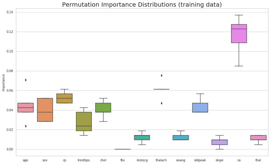
(sns.boxplot(data=perm_train_df)
.set(title='Permutation Importance Distributions (training data)',
ylabel='Importance'));
plt.show()
# create our dataframe of feature importances
feat_imp_df = eli5.explain_weights_df(estimator =lgb_model, feature_names=train_X.columns.tolist())
feat_imp_df.head()
| feature | weight | |
|---|---|---|
| 0 | cp | 0.213396 |
| 1 | ca | 0.152011 |
| 2 | thalach | 0.120438 |
| 3 | oldpeak | 0.088585 |
| 4 | age | 0.087723 |
estimator =lgb_model


estimator.feature_importances_
array([113, 36, 38, 65, 90, 0, 31, 120, 23, 86, 24, 56, 24])
features=train_X.columns.tolist()

# simple exmaple of a patient with feature values below
example = np.array([70,	1,	3,	100,	200,	1,	0,	150,	0,	2.3,	0,	0,	1])
eli5.explain_prediction_df(lgb_model, example, feature_names=features)
lgb_model.predict(example.reshape(1,-1))
array([1])
Partial Dependence Plots
Partial dependence plots show the marginal effect between the predicted label/ target function from a machine learing model and a set of features. The limits size of the target feature set is usually one or two. The target features are usually chosen among the most important features. A partial dependence plot can capture linear, monotonous and complex relationships between the target variable and the features of interest.
Partial dependence works by marginalizing the machine learning model output over the distribution of the features whose partial dependence function should be plotted, so that the function shows the relationship between those features and the predicted outcome. By marginalizing over the other features in the model , we get a function that depends only on the specified features and its interactions.
from matplotlib import pyplot as plt
from pdpbox import pdp, get_dataset, info_plots
from sklearn.ensemble.partial_dependence import partial_dependence, plot_partial_dependence
# import machine learning algorithms
from sklearn.ensemble import GradientBoostingClassifier
from sklearn.metrics import classification_report, confusion_matrix, roc_curve, auc

bg_color = (0.5, 0.5, 0.5)

sns.set(rc={"font.style":"normal",
            "axes.facecolor":bg_color,
            "axes.titlesize":20,
            "figure.facecolor":bg_color,
            "text.color":"black",
            "xtick.color":"black",
            "ytick.color":"black",
            "axes.labelcolor":"black",
            "axes.grid":False,
            'axes.labelsize':10,
            'figure.figsize':(10.0, 10.0),
            'xtick.labelsize':10,
            'ytick.labelsize':10})
sns.set_style("whitegrid")
my_model = GradientBoostingClassifier()
my_model.fit(X=train_X, y=train_y)
# Here we make the plot
my_plots = plot_partial_dependence(my_model ,
                                   features=[0,1, 2,3,4,5], # column numbers of plots we want to show
                                   X=train_X,            # raw predictors data.
                                   feature_names=['age','cp', 'thalach','ca','chol','sex'], # labels on graphs
                                   grid_resolution=10) # number of values to plot on x axis
plt.show()
Individual Conditional Expectation (ICE)
from pycebox.ice import ice, ice_plot

# pcyebox likes the data to be in a DataFrame so let's create one with our imputed data
# we first need to impute the missing data
train_X_df = pd.DataFrame(train_X, columns=X.columns)
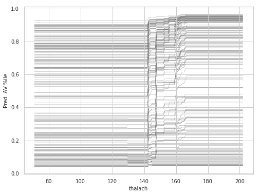
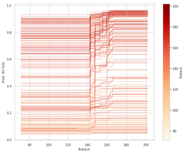
thalach_ice_df = ice(data=train_X_df, column='thalach',
                   predict=lgbm.predict)

rcParams['figure.figsize'] = 8,6

ice_plot(thalach_ice_df , c='dimgray', linewidth=0.3)
plt.ylabel('Pred. AV %ile')
plt.xlabel('thalach');
plt.show()
#ice_plot(thalach_ice_df, linewidth=0.5,color_by='data_thalach', cmap=cmap2)
#wt_vals
#thalach_ice_df
#plt.show()
# figure size in inches
rcParams['figure.figsize'] = 10,8
# new colormap for ICE plot
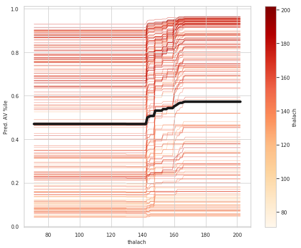
cmap2 = plt.get_cmap('OrRd')
# set color_by to Wt, in order to color each curve by that player's weight
ice_plot(thalach_ice_df, linewidth=0.5, color_by='data_thalach', cmap=cmap2)
# ice_plot doesn't return a colorbar so we have to add one
# hack to add in colorbar taken from here:
# https://stackoverflow.com/questions/8342549/matplotlib-add-colorbar-to-a-sequence-of-line-plots/11558629#11558629
wt_vals = thalach_ice_df.columns.get_level_values('data_thalach').values
sm = plt.cm.ScalarMappable(cmap=cmap2,
norm=plt.Normalize(vmin=wt_vals.min(),
vmax=wt_vals.max()))
# need to create fake array for the scalar mappable or else we get an error
sm._A = []
plt.colorbar(sm, label='thalach')
plt.ylabel('Pred. AV %ile')
plt.xlabel('thalach');
plt.show()
# figure size in inches
rcParams['figure.figsize'] = 10,8
ice_plot(thalach_ice_df, linewidth=.5, color_by='data_thalach', cmap=cmap2, plot_pdp=True,
         pdp_kwargs={'c': 'k', 'linewidth': 5})
plt.colorbar(sm, label='thalach')
plt.ylabel('Pred. AV %ile')
plt.xlabel('thalach');
plt.show()
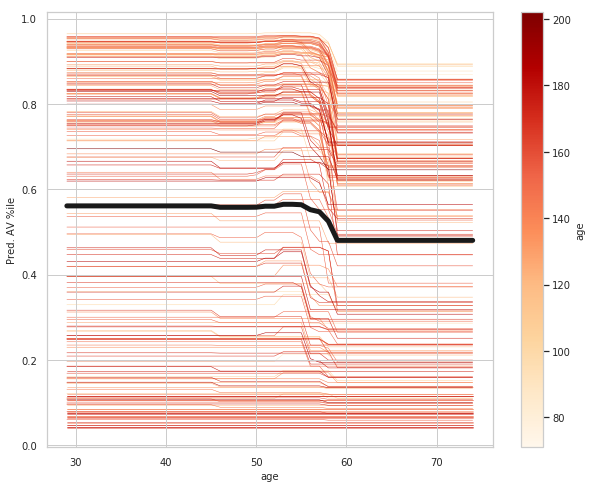
age_ice_df = ice(data=train_X_df, column='age',
                   predict=lgbm.predict)

# figure size in inches
rcParams['figure.figsize'] = 10,8
ice_plot(age_ice_df, linewidth=.5, color_by='data_age', cmap=cmap2, plot_pdp=True,
         pdp_kwargs={'c': 'k', 'linewidth': 5})
plt.colorbar(sm, label='age')
plt.ylabel('Pred. AV %ile')
plt.xlabel('age');
plt.show()
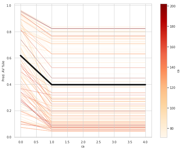
ca_ice_df = ice(data=train_X_df, column='ca'
                   ,predict=lgbm.predict)

# figure size in inches
rcParams['figure.figsize'] = 10,8
ice_plot(ca_ice_df, linewidth=.5, color_by='data_ca', cmap=cmap2, plot_pdp=True,
         pdp_kwargs={'c': 'k', 'linewidth': 5})
plt.colorbar(sm, label='ca')
plt.ylabel('Pred. AV %ile')
plt.xlabel('ca');
plt.show()
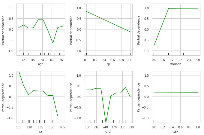
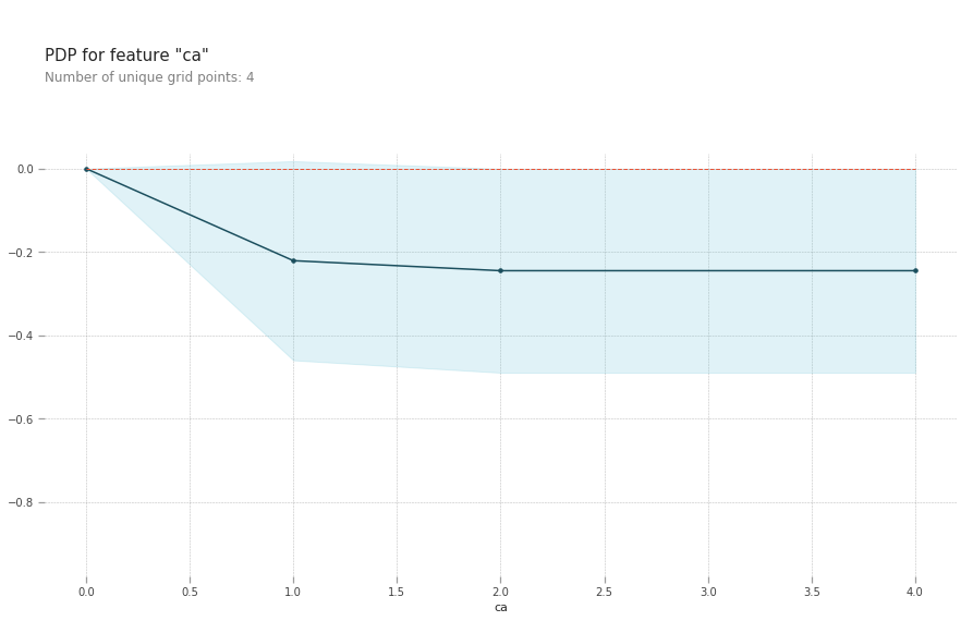
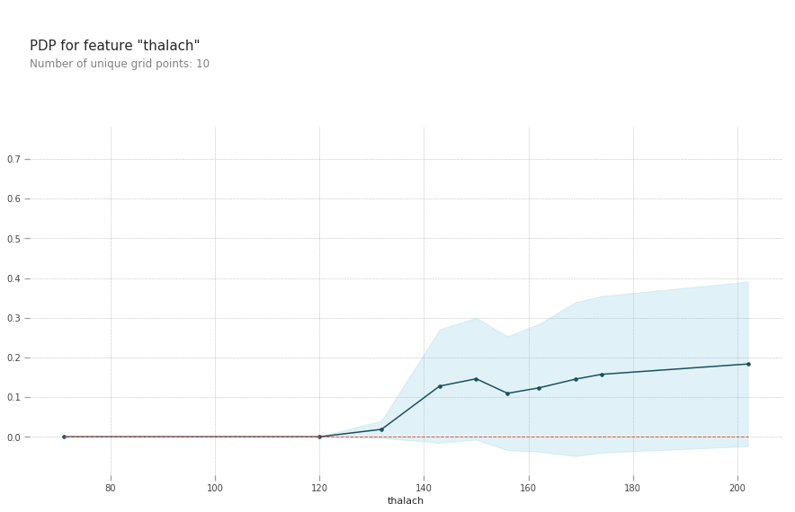
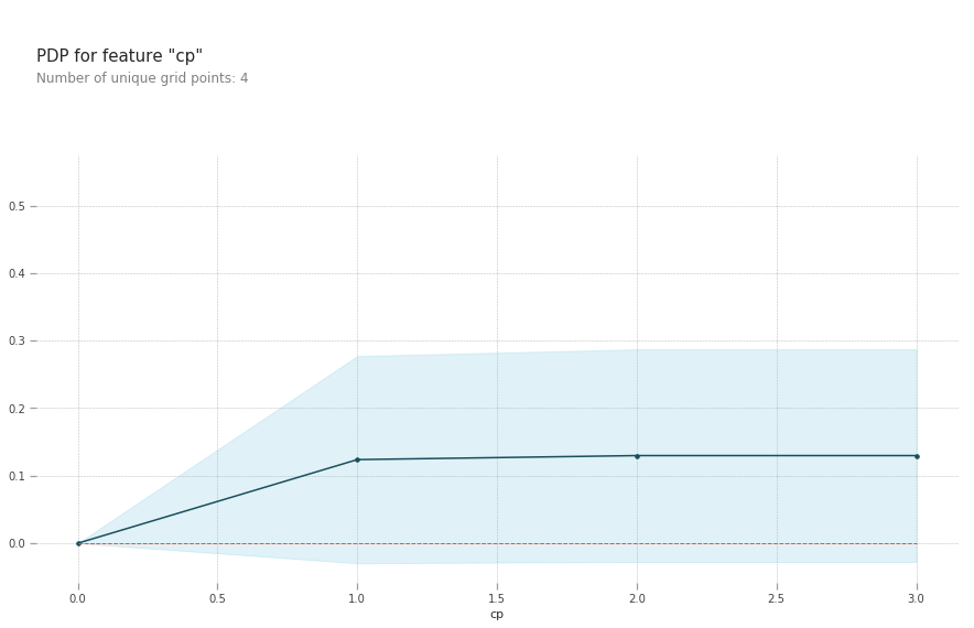
Interpreting Partial Dependence Plots
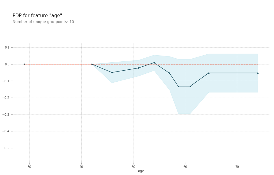
The top left plot shows the partial dependence between our target varaible Heart disease present or absent, and the age variable in years.
-
ca: number of major vessels (0-3) colored by flourosopy, having more major vessels colored by flouroscopy reduces your risk of a heart disease.
- cp: Having chest pain type 1 (typical angina) increases your average probability of having a heart disease. The increasing chance of heart disease remains constant for chest pain types 2,3 and 4.
-
thalach: maximum heart rate achieved above 120 increases your risk of heart disease.
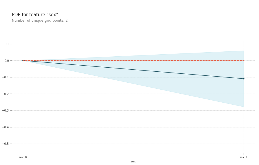
- Being a male slightly reduces your risk of a heart disease.
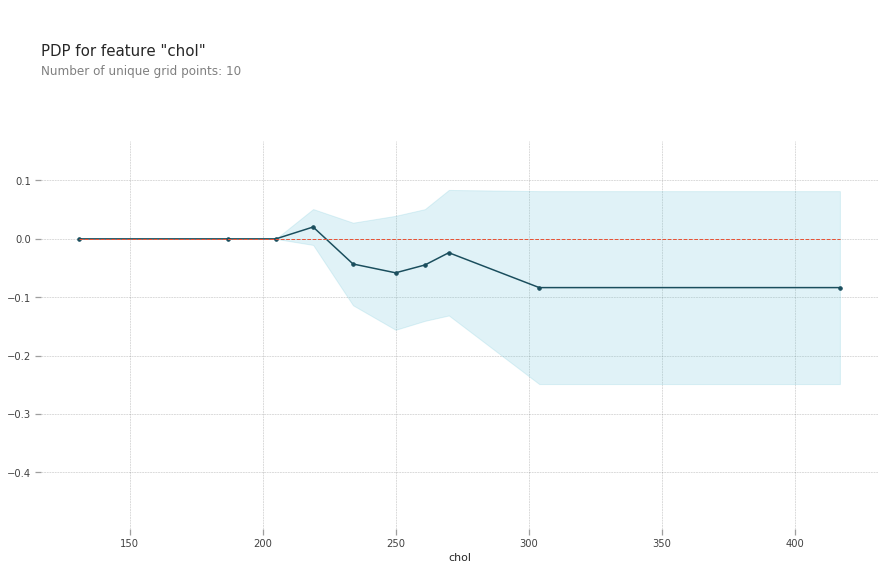
- chol: serum cholestoral in mg/dl, cholesterol level around 240 reduces your risk of heart disease. Above this level your risk goes up
from matplotlib import pyplot as plt
from pdpbox import pdp, get_dataset, info_plots

# Create the data that we will plot
pdp_goals = pdp.pdp_isolate(model=lgb_model, dataset=train_X,
                            model_features=val_X.columns.tolist(), feature='age')

# plot it
pdp.pdp_plot(pdp_goals, 'age')
plt.show()
# Create the data that we will plot
pdp_goals = pdp.pdp_isolate(model=lgb_model, dataset=train_X,
                            model_features=val_X.columns.tolist(), feature='ca')

# plot it
pdp.pdp_plot(pdp_goals, 'ca')
plt.show()
# Create the data that we will plot
pdp_goals = pdp.pdp_isolate(model=lgb_model, dataset=train_X,
                            model_features=val_X.columns.tolist(), feature='thalach')

# plot it
pdp.pdp_plot(pdp_goals, 'thalach')
plt.show()
# Create the data that we will plot
pdp_goals = pdp.pdp_isolate(model=lgb_model, dataset=train_X,
                            model_features=val_X.columns.tolist(), feature='cp')

# plot it
pdp.pdp_plot(pdp_goals, 'cp')
plt.show()
# Create the data that we will plot
pdp_goals = pdp.pdp_isolate(model=lgb_model, dataset=train_X,
                            model_features=val_X.columns.tolist(), feature='sex')

# plot it
pdp.pdp_plot(pdp_goals, 'sex')
plt.show()
# Create the data that we will plot
sns.set_style("whitegrid")
pdp_goals = pdp.pdp_isolate(model=lgb_model, dataset=val_X,
                            model_features=val_X.columns.tolist(), feature='chol')

# plot it
pdp.pdp_plot(pdp_goals, 'chol')
plt.show()
# figure size in inches
rcParams['figure.figsize'] = 10,13
sns.set_style("whitegrid")
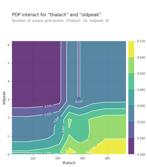
pdp_interaction = pdp.pdp_interact(model=lgb_model, dataset=val_X, model_features=val_X.columns.tolist(), features=['thalach', 'oldpeak'])
pdp.pdp_interact_plot(pdp_interact_out=pdp_interaction, feature_names=['thalach', 'oldpeak'], plot_type='contour')
plt.show()
from matplotlib import pyplot as plt
plt.figure(figsize=(15,10))
sns.set_style("whitegrid")
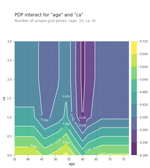
pdp_interaction = pdp.pdp_interact(model=lgb_model, dataset=val_X, model_features=val_X.columns.tolist(), features=['age', 'ca'])
pdp.pdp_interact_plot(pdp_interact_out=pdp_interaction, feature_names=['age', 'ca'], plot_type='contour')
plt.show()
<matplotlib.figure.Figure at 0x7fb4674430f0>
from matplotlib import pyplot as plt
plt.figure(figsize=(15,10))
sns.set_style("whitegrid")
pdp_interaction = pdp.pdp_interact(model=lgb_model, dataset=val_X, model_features=val_X.columns.tolist(), features=['age', 'sex'])
pdp.pdp_interact_plot(pdp_interact_out=pdp_interaction, feature_names=['age', 'sex'], plot_type='contour')
plt.show()
<matplotlib.figure.Figure at 0x7f4078e22400>
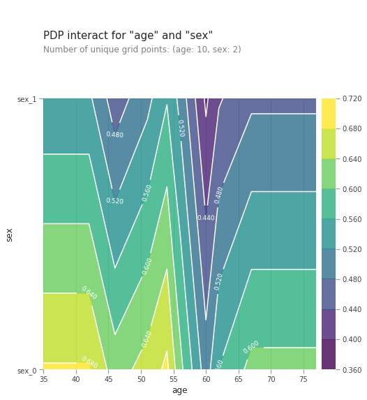
Combined effect of age and ca , number of major vessels (0-3) colored by flourosopy on heart disease prediction is shown above. Any age combined with low ca number increases the risk of heart disease. This is shown by the yellow colors just above the horizontal axis. Any age also with high ca number reduces the risk if a heart disease shown by blue and purple regions higher up the chart. The effect of ca number on heart disease prediction is stronger than the age variable.
SHapley Additive exPlanations (SHAP) Values
SHAP measures the impact of features taking into account the interaction with other features. Shapley values calculate the feature importance by comparing two predictions, one with the feature included and the other without it. The positive SHAP values affect the prediction/target variable positively whereas the negative SHAP values affect the target negatively. The effects of a feature on a single example of the data can also be studied with SHAP values. The SHAP method is used to calculate influences of variables on the particular observation. This technique was borrowed from game theory. SHAP is model agnostic, it works with a variety of supervised machine learning models form xgboost, lightgbm, deep learning models.
import xgboost
import shap

# load JS visualization code to notebook
shap.initjs()
#select a random row between 0 and 80
row_to_show = random.randint(0,val_X.shape[0])
#row_to_show = 10
data_for_prediction = val_X.iloc[row_to_show]  # use 1 row of data here. Could use multiple rows if desired
data_for_prediction_array = data_for_prediction.values.reshape(1, -1)


# explain the model's predictions using SHAP values
# (same syntax works for LightGBM, CatBoost, and scikit-learn models)
explainer = shap.TreeExplainer(lgb_model)
#shap_values = explainer.shap_values(train_X)

# visualize the first prediction's explanation (use matplotlib=True to avoid Javascript)
#shap.force_plot(explainer.expected_value, shap_values[0,:], train_X.iloc[0,:])
shap.initjs()
#shap.force_plot(explainer.expected_value, shap_values[row_to_show], data_for_prediction)
shap.force_plot(explainer.expected_value[0], shap_values[1], data_for_prediction)
#shap.force_plot(explainer.expected_value, shap_values[0,:], val_X.iloc[0,:])

Have you run `initjs()` in this notebook? If this notebook was from another user you must also trust this notebook (File -> Trust notebook). If you are viewing this notebook on github the Javascript has been stripped for security. If you are using JupyterLab this error is because a JupyterLab extension has not yet been written.
The above explanation shows features each contributing to push the model prediction from the base value (the average model prediction over the training dataset we passed) to the model prediction. Features pushing the prediction higher are shown in red, those pushing the prediction lower are in blue .
Exlanations for the whole dataset can be obtained by combining many explanations , rotating them 90 degrees, and then stacking them horizontally
import random


lgb_model.predict_proba(data_for_prediction_array)
array([[0.84938913, 0.15061087]])
data_for_prediction.as_matrix()
data_for_prediction.values
explainer.expected_value
shap_values[row_to_show]
array([-0.24660923,  0.5942684 , -1.08236257, -0.30082934, -0.9082763 ,
        0.        ,  0.28450406, -1.01859325, -0.6946964 ,  1.19555418,
       -0.65066211,  0.75565923, -0.69125715])
import shap  # package used to calculate Shap values

# Create object that can calculate shap values
explainer = shap.TreeExplainer(lgb_model)

# Calculate Shap values
shap_values = explainer.shap_values(val_X)


# Create object that can calculate shap values
#explainer = shap.TreeExplainer(my_model)

# Calculate Shap values
#shap_values = explainer.shap_values(data_for_prediction)
If you look carefully at the code where we created the SHAP values, you’ll notice we reference Trees in shap.TreeExplainer(my_model). But the SHAP package has explainers for every type of model.
shap.DeepExplainer works with Deep Learning models. shap.KernelExplainer works with all models, though it is slower than other Explainers and it offers an approximation rather than exact Shap values. Here is an example using KernelExplainer to get similar results. The results aren’t identical because KernelExplainer gives an approximate result. But the results tell the same story.
# use Kernel SHAP to explain test set predictions
shap.initjs()
k_explainer = shap.KernelExplainer(my_model.predict_proba, train_X)
k_shap_values = k_explainer.shap_values(data_for_prediction)
shap.force_plot(k_explainer.expected_value[1], k_shap_values[1], data_for_prediction)
Using 212 background data samples could cause slower run times. Consider using shap.kmeans(data, K) to summarize the background as K weighted samples.
Have you run `initjs()` in this notebook? If this notebook was from another user you must also trust this notebook (File -> Trust notebook). If you are viewing this notebook on github the Javascript has been stripped for security. If you are using JupyterLab this error is because a JupyterLab extension has not yet been written.
# visualize the training set predictions
# load JS visualization code to notebook
shap.initjs()
shap.force_plot(explainer.expected_value, shap_values, train_X)
Have you run `initjs()` in this notebook? If this notebook was from another user you must also trust this notebook (File -> Trust notebook). If you are viewing this notebook on github the Javascript has been stripped for security. If you are using JupyterLab this error is because a JupyterLab extension has not yet been written.
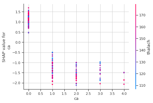
Shapley Dependence Plots
# create a SHAP dependence plot to show the effect of a single feature across the whole dataset
sns.set_style("whitegrid")
shap.dependence_plot("ca", shap_values, train_X)
import shap  # package used to calculate Shap values

# Create object that can calculate shap values
explainer = shap.TreeExplainer(my_model)

# calculate shap values. This is what we will plot.
shap_values = explainer.shap_values(X)

# make plot.
shap.dependence_plot('Ball Possession %', shap_values[1], X, interaction_index="Goal Scored")
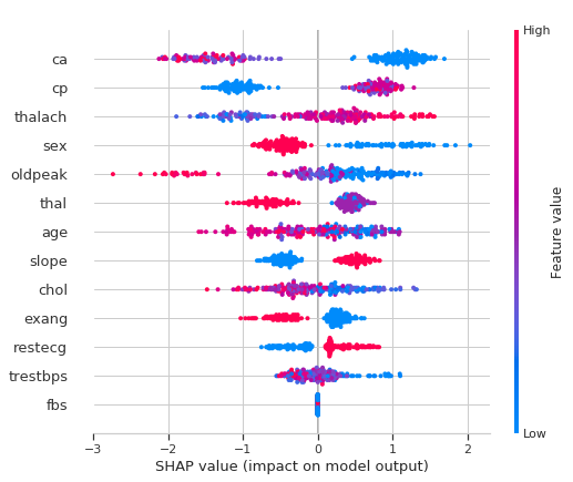
The most important features for the model contributing to the risk of heart disease can be shown by plotting the SHAP values of every feature for every sample. The plot below sorts features by the sum of SHAP value magnitudes over all samples, and uses SHAP values to show the distribution of the impacts each feature has on the model output. The color represents the feature value (red high, blue low)
-
High ca (number of major vessels (0-3) colored by flourosopy) lowers the predicted probabilty of having a heart disease.
-
Belonging to a low cp (chest pain type) category lowers the predicted probabilty of having a heart disease.
-
Being a male reduces your chance of a heart disease.
# summarize the effects of all the features
sns.set_style("whitegrid")
shap.summary_plot(shap_values, train_X)
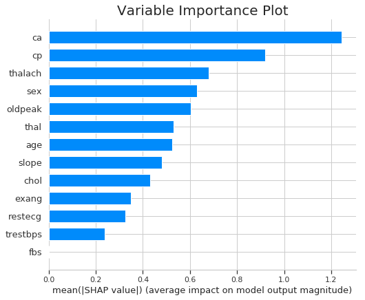
Variable importance plot can be plotted by taking the mean absolute value of the SHAP values for each feature.
sns.set_style("whitegrid")
plt.title("Variable Importance Plot")
shap.summary_plot(shap_values, train_X, plot_type="bar")
Local Interpretable Model-Agnostic Explanations (LIME )
LIME is model-agnostic, meaning that it can be applied to any machine learning model. The parts of the interpretable input contributing to the prediction is determined by perturbing the input around its neighborhood and observe how the model’s predictions change. The perturbed data is weighed by their proximity to the original example, and learn an interpretable model on those and the associated predictions.
Create the explainer
Tabular explainers use a training set to compute statistics on each feature. For continouous features,statistics such as the mean, standard deviation and discretizing into quartiles are computed.Frequency is computed for each categorical feature. The computed statistics are used to scale the data, so that we can meaningfully compute distances when the attributes are not on the same scale. It is also used to sample perturbed instances - which we do by sampling from a Normal(0,1), multiplying by the std and adding back the mean.
from lime import lime_text
from lime import *
import lime
from sklearn.pipeline import make_pipeline

sns.set_style("whitegrid")
predict_fn_lgbm = lambda x: lgb_model.predict_proba(x).astype(float)

X_val=val_X.as_matrix()

#target_names= ['1','0']
target_names= [str(i) for  i in train_y.unique()]

explainer = lime.lime_tabular.LimeTabularExplainer(X_val, feature_names=train_X.columns.tolist(), class_names=target_names, discretize_continuous=True)

i = np.random.randint(0, val_X.shape[0])
exp = explainer.explain_instance(X_val[i], lgb_model.predict_proba, num_features=10, top_labels=1)

#We now explain a single instance:

exp.show_in_notebook(show_table=True, show_all=False)
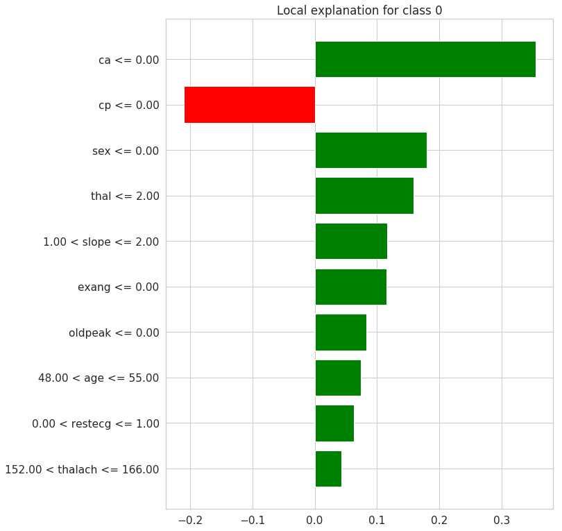
Plotting Decision Tree
# a plot of the weights for each feature
exp.as_pyplot_figure();
from sklearn.datasets import load_iris
from sklearn import tree
iris = load_iris()
clf = tree.DecisionTreeClassifier()
clf = clf.fit(iris.data, iris.target)
#tree.plot_tree(clf.fit(iris.data, iris.target))


import graphviz
dot_data = tree.export_graphviz(clf, out_file=None)
graph = graphviz.Source(dot_data)
graph.render("iris")
'iris.pdf'
dot_data = tree.export_graphviz(clf, out_file=None,
                      feature_names=iris.feature_names,
                      class_names=iris.target_names,
                      filled=True, rounded=True,
                     special_characters=True)
graph = graphviz.Source(dot_data)
graph

Explaining Predictions
For the particular example/row of the feature dataset picked randomly, the predicted target is not having a heart disease(0) with probability of 0.94. It can be inferred taht the features contributing to this prediction are the Feature Values shown in orange color above. These include ca, sex, cp, slope, thal, oldpeak and exang. The average probability contribution to the target class predicition from the individual features are shown in the midlle barplot above. The remaining features decreases prediction of the target class 0.